The ‘crossover collective’ is a social machine that focuses on an ancient form of communication as social activity: collective embroidery. The machine was designed by Floor Nijdeken and on show during the tradeshow ShowUp, which was held in Amsterdam at the 2nd and 3th of February. Like this focus on transfering knowledge or ‘heritage’ by… Continue reading collect moments
get lost
Just some true words. Get lost, a little. Even if it is just for the weekend. Picture via VosgesParis
memories
Intruiging photo’s by Chino Otsuka. A Tokyo born photographer, living in Britain since she was 10. In her work she deals with a repeating theme; “What makes a place a home and where does a sense of belonging comes from?”. In a lot of her projects she uses self-portraits to explore the themes of belonging,… Continue reading memories
when time stops the image…
Fotostudio De Jong is a documentary tv-program about photography. The show is presented by Wilfried de Jong, who is in this series constantly on the lookout for stories behind a photo and he gives his reflections on the images he finds. This show, which has a magazine-like format, is presented from his little photo gallery… Continue reading when time stops the image…
focus
Another inspiring designer story from the Herman Miller series ‘Why design‘. Nothing to add to the words of Don Chadwick ‘It’s our function as designers to see things other people don’t see’. So true.
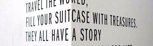
for now
I’ll have to wait… I’ll come down After a hectic, fun month and a lot more exciting stuff is about to happen. The styling and photography of Lab 71 with its calming, soothing fairytale atmosphere is the eyecandy that’s perfect for today. A little peace and quiet time. It’s so nice to walk through Frieda… Continue reading for now
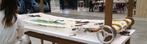
showstopper
Wow, what a suprise that was. The‘Vlisco Unfolded’ exibition at the Dutch Design Week 2013. Since this was finally the first time I really attendended the DDW, I did decide to join the DDWbloggerstour. So glad that Ulrike sent her invitation! Besides the fact it was organised so really well by Ulrike Jurklies, Willemijn de… Continue reading showstopper
the lion is back!
Today the 27th Edition of the Cinekid Festival has started! The premiére of this festival is the Swedish youth movie Eskil & Trinidad. Until the 25th of oktober 74 films will be exhibited, along with 26 television premieres, 21 documentaries, 12 dramaseries and 5 infotainment programs. The festival takes place on the great athmospheric grounds… Continue reading the lion is back!
craft, colour and cups
Totally in love with the ceramics designed by Alissa and Nienke. The thing I love most about these cups is the soft blended color tones on which they state on their website: ‘We love crafts, colors and cups. This is coming together in a material experiment with pigment and porcelain; a research about the flowing… Continue reading craft, colour and cups
soft
This years ‘Woonbeurs Pin 2013’ has been won by the TextielLab of the TextielMuseum in Tilburg. During the Woonbeurs this award is annually given to a person or organization that has an added value to the Dutch Interior world. The TextielLab presented itself last week on the Woonbeurs with a beautiful stand. The TextielMuseum nominated… Continue reading soft
numbers
What a great mix this combo of sports and typography. Together in this book ‘Footballtype’ designed and published by Face37 founder Rick Banks and co-authored by writer Sheridan Bird. ‘Football type is a non profit book celebrating football and typography. The book is a limited edition of 1000 with each cover hand numbered using official FAPL… Continue reading numbers
birthday
As ‘Fotograaf des Vaderlands’ Ilvy Njikiktjien is for one year the face of Fotoweek and acts as the Ambassador of the Dutch photography. ‘Kijk! Mijn Familie’ is the theme of Fotoweek; for ten days an ode to photography. Especially for Fotoweek 2013 Ilvy makes a photo series about birthday parties. She visits 100 birthdays. Special and… Continue reading birthday
today
‘On a wednesday’ is an attempt to collect stories. Stories give a sneak peak into someone’s life. Just by asking ‘what are you doing’ on a Wednesday. It’s such a charming simple idea. The project is created by Dave Dawson and Bekka Palmer. Striking. via swiss-miss
time
Stumbled upon this pictures by Rasmus Keger. Adding the time-typo gives so much extra info to the picture. At least that’s for me; it gets my fantasy running. Besides his impressive portfolio his blog is an absolute gem, love it.
truisms
Before 42nd Street NYC was turned around from a obscure neighborhood into a ultra-safe tourist playground. Artist Jenny Holzer temporarily put up her one-liners on the marquess, just before the old movie theaters were torn down. Couldn’t agree more with these truisms. Pictures by Don Shewey, via Interiorator